Showing posts with label renovations. Show all posts

Wednesday, July 3, 2013

Solid Gold (and Brass) Baby!

The kitchen reno is progressing nicely....we're at the drywalling stage with hardwood floor refinishing happening this weekend.  So...it's at the kinda boring grunt work stage.

BUT!  Some exciting things have been coming in the mail....


Like our satin gold faucet!  Yup, we're abandoning the chrome wave and going with gold and brass fixtures (in satin finishes, of course).  This is a Jewel faucet.  The great thing about Jewel is their made in Italy faucets come in tons of finishes...but all are polished.  So, we contacted the company to see if they would do a satin finish for us, and they did (and for no extra charge)!  The guys at the Canadian distributor in Surrey, BC were really great to work with!

And check out these babies, who just arrived today:
Satin brass cabinet edge pulls by Complete Cabinet Hardware.  Oh man, I cannot wait to see these guys peaking out from all our cupboards and drawers...

So yup, things are progressing.  Fingers crossed that we'll be installing cabinets in a little over a week...

Saturday, June 29, 2013

Reno Gold - Original Hardwood

So.....remember when I said we might consider refinishing the original hardwood under all those layers of vinyl tile in the kitchen if it was in decent condition...but that that was highly unlikely?

Well, surprise surprise!  There is beautiful golden hardwood under there and we are going to refinish it!

So, despite the fact that we spent hours upon hours selecting the perfect tile for the space, we are scrapping that and saving some serious $$! 

Refinishing won't come without challenges.  We realized that when after hours and hours and hours of scraping up vinyl tile we found a lovely hole in the floor in one of the most visible areas....but, overall we are thrilled with the idea of original hardwood.  We were always a bit uneasy about how the tile would age over time, but the hardwood is classic and true to the vintage of the house....and now we have a bit of room in the budget for surprises....or maybe a new light fixture!

Thursday, June 20, 2013

Kitchen Demo Progress

Now that the ceiling and walls are down, it's on to the floors...they consist of vinyl tile on vinyl tile on 1/4" ply on...you guessed it, more vinyl tile on original hardwood on original plank subfloor.  And ugh, it all has to come out!  If the hardwood is salvageable we may refinish, but that doesn't look too likely.  The good news is that none if the layers of vinyl tile contain asbestos (we had them tested)!

Wednesday, June 19, 2013

Let the Kitchen Renos Begin!

There's no turning back now!  After nearly 4 years of dreaming, planning, and designing...this is happening!

Check out the kitchen in its pre-demo state here.

Tuesday, September 6, 2011

The 1/2" That Turned into a Full Bathroom Reno

So all summer we've been going back and forth over whether or not we should completely renovate the upstairs apartment bathroom in our house.  It has a great original claw foot tub that we plan to keep no matter what, but the layout is just awful:
The door swings the wrong way and hits the tub, the toilet is squeezed into too small a space and the sink is wedged behind the door and doesn't really fit.  But, moving fixtures (and their required plumbing) is expensive.  And with an old house like ours, you never know what you might discover once you start opening things up and how much it will cost.  So, we chickened out.  We decided to simply replace the vanity and flip the door around so it swings against the wall. 

Things were going along smoothly until Ikea lied.  That's right...lied!  You see, the vanity we bought claimed to be 23-5/8" wide.  We measured over and over again to make sure it would fit and it looked as though we would have a 1/4" to spare.  Ok, so maybe it was only an 1/8" to spare, but it should fit!  But it doesn't!!  The sink cabinet is nearly 1/2" wider than that Swedish guy claims.  He seems so trustworthy on their radio ads...  So, if any of you are planning to squeeze a Godmorgon cabinet into a space, leave yourself an inch or so of tolerance!

So, rather than spending money squeezing some new fixtures and finishes into a badly arranged space...we've decided to bite the bullet and go for it, rearranging the layout so it works way better.  It'll depend on what the plumber says and how much his quote is, but we're hoping to achieve one of these two layouts:
The top layout is our preferred one.  It gives way more room around the sink and allows someone to stand there without getting hit by the door.  The alternate layout below would still work for us though, and it would mean moving less plumbing since the sink more or less stays where it is.  In either case, the beautiful claw foot tub is placed under the window and will be much more visible from the doorway.

And so, we have tentatively started gutting things:
Now we await our plumber to come let us know what the damage will be to get things rearranged...fingers crossed we can make this happen!

Monday, September 5, 2011

Upstairs Apartment ... Let the Renos Begin!

Somehow, I don't know how, September is already here.  With the summer behind us and our tenants moved out, we are launching full swing into renovations of our upstairs apartment.  After just 3 days we've had some surprises, scrapped some plans, made new ones, and have already realized that our 1 month timeline is probably just a little unrealistic.  We've got lots of exciting stuff planned for this apartment, but first...here is a tour of how it all looked on September 1st:

On the left is the hall.  We painted this about a year ago when our tenants were on vacation and plan to keep the colour.  On the right is the oh so very red bedroom...not a bad shade of red, but it definitely doesn't fit with the colour scheme we chose.
The living room.  A good sized room with a great view of the street below.  Not a ton to here other than paint and hopefully refinish the floor a bit.
The tiny 2nd bedroom / office / whatever-else-we-can-fit-in-there room.  For some reason the previous owner went hogwild installing outlets in this room.  They're all over!  Even along the top of the room!  Who could need so much plugged in to one tiny room??
Ah yes, the 'kitchen'.  Before the house was split into two separate apartments, this would have been a bedroom.  Not a lot of cupboard space...we added the blue cabinets over the sink about a year ago, but will still probably need more.  We'll likely add some shelving here and there for extra storage.
And finally...the bathroom.  The claw foot tub is original and beautiful (though it could use refinishing).  The toilet is new - we installed it last year to help conserve water (it's low flow and dual flush!).  And that sink...is a throwaway.  We've wavered on how much to tackle in this room.  The layout is awful and could be so much better, but moving fixtures is expensive...but more on those plans another time...

So, there you have it. The upstairs apartment 'before' shots.  It's exciting and daunting at the same time to finally be carrying out some of the plans we've been making over the last few months.  Unfortunately we can't tackle too too much until our electrician finishes replacing all the old wiring.  Fingers crossed that process goes smoothly and we don't end up with too many holes in the walls!!

Monday, August 15, 2011

Upstairs Colour Scheme!

Planning is well underway for renovating the upstairs apartment of our house.  We have some boring but necessary stuff in the works (attic insulation) and some much more exciting stuff too (bathroom reno anyone?).  More on those projects later.

We've been digging through our fan decks and paint chips to come up with a colour scheme.  One blog that's been really helpful in the process is the Colour Collective.  Essentially the whole blog is a series of colour schemes pulled from inspiring (often fashion related) images.  Here are a few of our favourites:


There's a good chance it might change, but here is the colour scheme we have come up with so far:
The colours are all Benjamin Moore.  From left to right, they are:
Once September rolls around, we'll be able to start painting!

Saturday, August 13, 2011

Finishing off the Ground Floor Tour

With just a couple more weeks before we move into and start renovating the upstairs apartment of our house, I thought it was about time I finished off the ground floor tour.  Just like the kitchen, I wouldn't call any of these spaces 'done', but they have come a long way from when we first bought the house 2 years ago.

So...in case you missed them, you can see the kitchen here and the Living and Dining rooms here.  Now onto the bedroom, bathroom, and vestibule.

Here is how the bedroom looked when we purchased the house (all furniture belongs to the previous owner).
The previous owner actually apologized to us for this colour before handing over the keys.  Oh well, that was an easy fix.  We had ambitions to replace that acoustic tile ceiling with drywall...but that never happened...hopefully someday!  Anyways, here's how the bedroom looks now, or rather how it looked before we rented the downstairs apartment out last month...
If you're wondering why this room lacks the high ceilings and beautiful detailing of the rest of the house, it's because it was an addition added on at some point (though it's still very old).  Still, it's amazing what a little paint can do.  Oh, and that dresser was a great find at an estate sale.  It's a 1960's made in Canada piece that Tessa sanded down, stained Walnut, and switched out the original hardware with something a little more modern.

The biggest project in this room was adding built-in closet space.  For a solution, we looked no further than...Ikea:
Using hardware from Ikea's Kvartal line, we made six sliding fabric panels - much less expensive and less permanent than building in a wall with doors.  Ikea sells pre-made panels for this system...but we weren't too crazy about any of them, so we sewed these up using a few yards of fabric...still bought from Ikea.

Beyond paint, we didn't do too much to the bathroom.  The previous owners had installed the shower not long before we purchased the house and thankfully their taste in shower doors was much better than their taste in paint...here's the before (left) and after (right):
And here are a few more views.  You just can't beat the character found in these old houses - like that beautiful stained glass window over the bathtub.
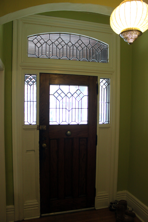
Having a bathroom this large on the ground floor of a Victorian house is rare and was definitely one of the features that sold us on the place.  This space would have originally been a hallway leading from the front door to the kitchen...I think this bathroom is a much better use of space.  Speaking of the front door, that brings us to the last space on the ground floor...the front vestibule.  This is the best before shot I have:
In this space, all we have done so far is paint and hang a new light fixture.
I wish I could say that we bought that light fixture while travelling in Morocco and that we met the artisan who made it and he was a really cool guy...but that would be lying.  We've never been to Morocco...we bought it at Home Sense...and it was on sale...only $50 I think!

So, there you have it - the rest of the ground floor.  We've been itching to tackle some projects upstairs in the fall and have been making lots of plans...stay tuned!

Oh, and here are the colours we used in these rooms:
Bedroom:  Benjamin Moore, Boothbay Gray, HC-165
Bathroom: Benjamin Moore, Gray, 2121-10 (really!  they couldn't come up with a better name?)
Vestibule: ICI, Shakespeare

Tuesday, May 24, 2011

Porch Restoration Part 1: wash, strip, sand, fill, repeat

Finally...FINALLY, we got to work on restoring our porch this weekend.  Remember all those Porch Paint Possibilities?  Well, we chose one...sort of (more on that later) and with the perfect collision of gorgeous weather and a long weekend, we (nearly) finished returning our 120 year old Victorian porch to a more dignified state.

And remember when I said the work needed on the porch was mostly cosmetic?  Ha!  Not quite.  It took a full day and a half of washing, stripping, sanding, and wood filling before we even started painting.  I suppose that's not so bad in the grand scheme of things...but man, it was so tempting to just start slathering on shiny new paint.

After a light power washing, it was time to scrape.  Thankfully we bought a '14 in 1 Universal Tool for Painting and Projects'.
I'm not entirely sure of the other 13 things this tool does, but as far as scrapy things go, this tool was among the scrapiest.  After a good 6 hour scrape-down, it was time to bring out the big guns:
What?  Your drill doesn't come with a medieval torture device attachment?  Upon closer inspection, it turns out that this is actually an 'Original Easy Stripper'. (as seen on TV, so it must be good, right?)
I was hesitant to go at it with my easy stripper (as one should be), but somehow, the easy stripper doesn't damage wood, even 120 year old wood.  Just look at this before and after of one particularly nasty section of wood soffit:
Yeehaw I said.  Yeehaw indeed.  Now some of that paint just wasn't coming off.  I'm sure we could have gone out and bought some toxic paint eating chemical...but that's just not our thing.  Instead we accepted imperfection, and cleaned up the worst of the 'topography' with some 'Dap Drydex Spackling'.  It goes on pink and dries white!
Thankfully, this stuff dries fast.  So after some serious sanding (followed by some serious damp mopping), we were ready to paint!

Oh, and I almost forgot, check out our ugly mailbox and the amazingness we discovered behind it:
Needless to say, we decided not to put our mailbox back up, opting to stick with this original mail slot.

Now I know, if you've read this far, you must be patiently awaiting some sort of reveal of the finished product.  Well, as I mentioned, we're not quite done.  After 50 man hours (I mean person hours), we still have to put a second coat on the base of the porch, paint the actual porch floor, and touch up some of the details.  We'll get there soon.  In the meantime, to quench your curiosity, here's a sneak peak:

Sunday, April 10, 2011

Living and Dining Room...After

As promised, here are some after photos of our Living and Dining Rooms:

So most of the new pieces in this photo are from...you guessed it...Ikea.  Expedit shelves, Mongstad mirror, Gilbert Dining Room chairs (though the colour has since been discontinued), and the Olunda alphabet print (the perfect print for an Interior Designer turned Preschool Teacher...aka, Tessa). (see it before)

Our Dining Room chandelier, purchased from Living Lighting. (see it before)

Though everything around it has changed, the fireplace remains the same...more on that later.  The rug in this photo was from...cringe...this place, but it was a steal at $30!  The painting, lamp, and vase were all from Home Sense (we're clearly still being weaned off of big box stores...sigh) (see it before)

We rescued this couch from the peril of dumpsterdom at Ikea (as it was being discontinued), though we still had to pay for it, it was a great deal!  The painting is a Tessa original...based on one that Ikea used to sell. (see it before)

There's the newest addition to our family.
(see it before)

The bay window with a chaise, also saved from Ikea dumpsterdom.
(see it before)

There you have it.  The Living and Dining Rooms as they look today.  The colours are Benjamin Moore with Boothbay Gray (HC165) on the walls and Wrought Iron (2124-10) above the fireplace. 

As I said before, for now, the rooms are done.  There are a couple longer term things we plan to do, such as refinish the hardwood floors, do something with the fireplace...and Tessa is already thinking of repainting!

-kyle and tessa


Tuesday, April 5, 2011

Reuse, Refinish, Re-Purpose

We knew when it came to furnishing our house that buying all new furniture just wouldn't cut it.  Not only could we not afford it but placing all those new objects in a space that has evolved over 120 years would rob it of its character and soul.  And so...we have mixed up a few new items with ones that have been Reused, Refinished, and Re-purposed.

See, there are way more than just 3 R's.  In fact, the greenest, most environmentally friendly product is the one that's never made.  Here are a few of my favourite 'vintage' items from our Living and Dining rooms.


Our sideboard has quite a story to tell.  We found him while on a weekend getaway in Ottawa, Ontario.  It was in an antique shop specializing in Scandinavian mid-century modern antiques (I think this one).  After scouring the shop and finding everything was way out of our price range, we headed down to the basement where we uncovered this piece, collecting dust in a corner...for only $300!!  You see, it's made of white oak, not teak like most Scandinavian pieces.  It's also meant to sit on top of a larger sideboard as a hutch (the owner added the legs).  These two factors combined to make the price just right for us.

But how to get it from Ottawa to our house, 500+km away?  Thankfully, the owner of the shop makes frequent trips to Toronto (only 60km away...in case you haven't figured it out, we live in Hamilton!) and agreed to bring it that far during his next trip.  So we met him there...in our compact car a drove it all the way home with it sticking half way out of our trunk!  But we made it and boy do we love this piece!


It's not all about big pieces.  We found this suitcase when Tessa's grandmother was downsizing and getting rid of things.  Man, this suitcase has been around.  It's dented and scratched, but still solid (thanks to its 'four-ply solidon construction'...according to the McBrine Baggage label on it).  Just think of where this suitcase has been and what has it seen!  Now it sits in a corner of our dining room and houses old photo albums.


This Dining room table belonged to Tessa's parents.  We found it in a corner of their basement and claimed it as ours.  Apparently when Tessa's parents were first married, her mom lovingly sanded and refinished it.  When we got our hands on it we painted it a pale blue!  Wood table on wood floor = blah.  Painted table on wood floor = win!  I like the proportions of its slender bulbous legs and how cool is it that it was made by good old Walter and Company in Wabash, Indiana?  Still, it's a bit small for the space.  Stay tuned for our DIY projects post to see how we solved that...


We went through a painting stuff phase (perhaps stemming from the fact that Tessa worked in a paint/interiors store a few years back).  These chairs were another find at Tessa's grandmother's.  This time we went with a high sheen black/blue/grey (depends on the light).  Sturdy chairs.  In fact, I'm sitting on one, RIGHT NOW!

 '
Finally, something we 'aquired' from my side of the family.  This 1960s chair belonged to my grandmother.  And guess what?  It's a pull out.  So if you're ever in town, we've got one super uncomfortable 50 year old pull out twin sized bed (my 8 year old self can attest to this lack of comfort).  In chair form...it's great though.  I'm told my grandmother re-upholstered it at some point, probably in the 1970's.  And who's that perched on it you ask?  Charles Augustus, our schweenie of course - he has excellent taste.

There you have it - our reused, refinished, and re-purposed pieces - each with it's own story to tell.  I'll post some overall pics of these rooms soon so you can see how these vintage pieces are balanced out by newer pieces.

-kyle

Sunday, April 3, 2011

Living and Dining Room...Before

I absolutely love the living and dining room in our house.  The rooms have perfect proportions - each is a perfect square with 10' ceilings.  At some point the wall between the two rooms was removed and replaced by a large archway.  While I enjoy the openness and flexibility of this change, I cringe to think of what might have happened to the original pocket doors that I'm almost certain would have inhabited the wall. 

Regardless, these rooms have excellent bones - beautiful plaster crown mouldings, 10" baseboards, original hardwood (that needs refinishing...), and those ceiling medallions.  I won't lie, I've spent a good deal of time lying on the floor just staring at them....imagining the hands that made them...studying their intricate detail...and watching shadows play across them.  Yes indeed...with such lovely bones, this room hasn't needed any extensive renos...though we have made quite a few changes. 

The pictures below show the rooms in their pre-Kyle and Tessa state.  The furnishings and decor belong to the previous owner. 

The Dining Room - mmmm flesh coloured walls and ceiling.  It reminds me of that scene in Garden State...except um, for nudists I guess?  Sorry about that visual everyone...moving on...


A detail of Dining Room plaster medallion and light fixture.  The previous owner made sure we were aware that this light fixture (and the one in the living room) is a period appropriate antique.  That may be true...but surely those blue shades are not.  Regardless of 'authenticity', we're not slavish historicists and frankly, the room deserves better.
  
The Living Room - unfortunately the fireplace was rebuilt at some point...and without the detail that is typical in a late 19th century Victorian...we've gone back and forth on whether or not to paint the brick. 

Living Room - look how cleverly the previous owner concealed the awkwardly placed thermostat...can you spot it?


Living Room medallion, archway with corbels, Dining Room beyond.


I wish we had a better shot of the bay window, but this at least shows some of the great details of the window trim


Just today we installed what I like to call, la pièce de résistance in the Living Room. You'll have to wait and see what it is...but trust me...it's spectacular. Though the rooms (and entire house) are a continual work in progress, for now I'd say that the Living Room and Dining Room are 'done'. Over the next little while, I'll share the details, DIY projects, repurposed/recycled finds, and new objects that have helped make these rooms our own.

-kyle