Showing posts with label house interior. Show all posts

Wednesday, July 3, 2013

Solid Gold (and Brass) Baby!

The kitchen reno is progressing nicely....we're at the drywalling stage with hardwood floor refinishing happening this weekend.  So...it's at the kinda boring grunt work stage.

BUT!  Some exciting things have been coming in the mail....


Like our satin gold faucet!  Yup, we're abandoning the chrome wave and going with gold and brass fixtures (in satin finishes, of course).  This is a Jewel faucet.  The great thing about Jewel is their made in Italy faucets come in tons of finishes...but all are polished.  So, we contacted the company to see if they would do a satin finish for us, and they did (and for no extra charge)!  The guys at the Canadian distributor in Surrey, BC were really great to work with!

And check out these babies, who just arrived today:
Satin brass cabinet edge pulls by Complete Cabinet Hardware.  Oh man, I cannot wait to see these guys peaking out from all our cupboards and drawers...

So yup, things are progressing.  Fingers crossed that we'll be installing cabinets in a little over a week...

Saturday, June 29, 2013

Reno Gold - Original Hardwood

So.....remember when I said we might consider refinishing the original hardwood under all those layers of vinyl tile in the kitchen if it was in decent condition...but that that was highly unlikely?

Well, surprise surprise!  There is beautiful golden hardwood under there and we are going to refinish it!

So, despite the fact that we spent hours upon hours selecting the perfect tile for the space, we are scrapping that and saving some serious $$! 

Refinishing won't come without challenges.  We realized that when after hours and hours and hours of scraping up vinyl tile we found a lovely hole in the floor in one of the most visible areas....but, overall we are thrilled with the idea of original hardwood.  We were always a bit uneasy about how the tile would age over time, but the hardwood is classic and true to the vintage of the house....and now we have a bit of room in the budget for surprises....or maybe a new light fixture!

Thursday, June 20, 2013

Kitchen Demo Progress

Now that the ceiling and walls are down, it's on to the floors...they consist of vinyl tile on vinyl tile on 1/4" ply on...you guessed it, more vinyl tile on original hardwood on original plank subfloor.  And ugh, it all has to come out!  If the hardwood is salvageable we may refinish, but that doesn't look too likely.  The good news is that none if the layers of vinyl tile contain asbestos (we had them tested)!

Wednesday, June 19, 2013

Let the Kitchen Renos Begin!

There's no turning back now!  After nearly 4 years of dreaming, planning, and designing...this is happening!

Check out the kitchen in its pre-demo state here.

Monday, April 23, 2012

The Nursery Begins...

Life's about to get a whole lot different around these parts.  Yup, we're expecting...TWINS.  Identical twin boys to be exact.  We've got about 3 1/2 months until our little bundles of joy arrive, so we're getting down to business and prepping the nursery.

This weekend's task...build an Ikea Pax wardrobe.  We initially had hopes of finding something vintage, but the busyness of life and the exhaustion of pregnancy squashed our visions of scouring flea markets and antique stores.  So we defaulted to Ikea (of course).  Besides, now that we are living in our 750 square foot upstairs apartment, space and especially storage are at a premium.  The customizability of Ikea's Pax system help make the most of what room we have.

Just like the Ikea flyers tell you, when space is at a premium, maximize vertical storage.  At 8' tall, this wardrobe does just that.  What they failed to mention (and what I failed to think of) is that that vertical storage gets built horizontally...and needs a whole lot of floor space...

Yup...just enough space in our 8'x12' nursery to inch my way around and get this thing built.  I had some reservations about not having enough room to tip the wardrobe vertically...but a little manouvering and we somehow got it in place.
We opted for glass Storas doors - they are slightly reflective and subtly transluscent, so they help reduce the massiveness of the wardrobe.  We had initally planned for two hanging rods, but decided that drawer space is more practical...after all, are we really going to have time to put each of their teeny pieces of clothing on hangers.  Not likely.  So we'll just throw nicely fold everything and shove gently place it in one of the three Komplement drawers.  We've left space at the top and bottom to add some storage bins to fill with whatever other crap nice things the babies come with.

Oh and hey, did you see those awesome wooden animals in the first picture?
We picked them up on our last-real-vacation-ever-before-our-lives-are-consumed-by-kids trip last fall in Copenhagen.  Copenhagen is pretty much the best place on earth for kids stuff - there's a toy / kids store on just about every corner.  I think it's something to do with the legacy of LEGO (did you know that "LEGO" is from the Danish phrase leg godt, which means "play-well", I do, because Wikipedia just told me).

Anyways, these little guys are from Holztiger.  They are handcrafted, handpainted, and Made in Europe.  And yes, I fully realize that one day our little angels will colour all over them with marker.  That's why I took a picture of them.

And now for some tips for anyone building a Pax wardrobe right now and found this post by googling "I would rather have a big Pax bonfire than continue building this giant wardrobe!"
  • even though when you generated your shopping list from the easy as pie Pax wardrobe planner, it says that the hinges are included with your Storas door, they are not.  Get over it.  They are in a separate bin that you can only find by asking someone.  If you, like me, did not realize this fact until you got home and were trying to put your wardrobe together, you will have to drive all the way back to the store to get them...yay!
  • Komplement drawers can be placed in every 6th hole.  That means drawer, 5 empty holes, then another drawer.
  • Hinges get in the way of your available holes.  Put the doors on first so you can see where your other stuff can go.
  • If you (like pretty much everyone) have baseboards / quarter round around the perimeter of your room, your wardrobe will not sit flush against the wall, making it difficult to use the provided holes in the back of the wardrobe to anchor it to the wall.  Instead I plan to buy some steel L brackets from the hardware store to connect the top of the wardrobe to the wall.

Monday, September 5, 2011

Upstairs Apartment ... Let the Renos Begin!

Somehow, I don't know how, September is already here.  With the summer behind us and our tenants moved out, we are launching full swing into renovations of our upstairs apartment.  After just 3 days we've had some surprises, scrapped some plans, made new ones, and have already realized that our 1 month timeline is probably just a little unrealistic.  We've got lots of exciting stuff planned for this apartment, but first...here is a tour of how it all looked on September 1st:

On the left is the hall.  We painted this about a year ago when our tenants were on vacation and plan to keep the colour.  On the right is the oh so very red bedroom...not a bad shade of red, but it definitely doesn't fit with the colour scheme we chose.
The living room.  A good sized room with a great view of the street below.  Not a ton to here other than paint and hopefully refinish the floor a bit.
The tiny 2nd bedroom / office / whatever-else-we-can-fit-in-there room.  For some reason the previous owner went hogwild installing outlets in this room.  They're all over!  Even along the top of the room!  Who could need so much plugged in to one tiny room??
Ah yes, the 'kitchen'.  Before the house was split into two separate apartments, this would have been a bedroom.  Not a lot of cupboard space...we added the blue cabinets over the sink about a year ago, but will still probably need more.  We'll likely add some shelving here and there for extra storage.
And finally...the bathroom.  The claw foot tub is original and beautiful (though it could use refinishing).  The toilet is new - we installed it last year to help conserve water (it's low flow and dual flush!).  And that sink...is a throwaway.  We've wavered on how much to tackle in this room.  The layout is awful and could be so much better, but moving fixtures is expensive...but more on those plans another time...

So, there you have it. The upstairs apartment 'before' shots.  It's exciting and daunting at the same time to finally be carrying out some of the plans we've been making over the last few months.  Unfortunately we can't tackle too too much until our electrician finishes replacing all the old wiring.  Fingers crossed that process goes smoothly and we don't end up with too many holes in the walls!!

Monday, August 15, 2011

Upstairs Colour Scheme!

Planning is well underway for renovating the upstairs apartment of our house.  We have some boring but necessary stuff in the works (attic insulation) and some much more exciting stuff too (bathroom reno anyone?).  More on those projects later.

We've been digging through our fan decks and paint chips to come up with a colour scheme.  One blog that's been really helpful in the process is the Colour Collective.  Essentially the whole blog is a series of colour schemes pulled from inspiring (often fashion related) images.  Here are a few of our favourites:


There's a good chance it might change, but here is the colour scheme we have come up with so far:
The colours are all Benjamin Moore.  From left to right, they are:
Once September rolls around, we'll be able to start painting!

Saturday, August 13, 2011

Finishing off the Ground Floor Tour

With just a couple more weeks before we move into and start renovating the upstairs apartment of our house, I thought it was about time I finished off the ground floor tour.  Just like the kitchen, I wouldn't call any of these spaces 'done', but they have come a long way from when we first bought the house 2 years ago.

So...in case you missed them, you can see the kitchen here and the Living and Dining rooms here.  Now onto the bedroom, bathroom, and vestibule.

Here is how the bedroom looked when we purchased the house (all furniture belongs to the previous owner).
The previous owner actually apologized to us for this colour before handing over the keys.  Oh well, that was an easy fix.  We had ambitions to replace that acoustic tile ceiling with drywall...but that never happened...hopefully someday!  Anyways, here's how the bedroom looks now, or rather how it looked before we rented the downstairs apartment out last month...
If you're wondering why this room lacks the high ceilings and beautiful detailing of the rest of the house, it's because it was an addition added on at some point (though it's still very old).  Still, it's amazing what a little paint can do.  Oh, and that dresser was a great find at an estate sale.  It's a 1960's made in Canada piece that Tessa sanded down, stained Walnut, and switched out the original hardware with something a little more modern.

The biggest project in this room was adding built-in closet space.  For a solution, we looked no further than...Ikea:
Using hardware from Ikea's Kvartal line, we made six sliding fabric panels - much less expensive and less permanent than building in a wall with doors.  Ikea sells pre-made panels for this system...but we weren't too crazy about any of them, so we sewed these up using a few yards of fabric...still bought from Ikea.

Beyond paint, we didn't do too much to the bathroom.  The previous owners had installed the shower not long before we purchased the house and thankfully their taste in shower doors was much better than their taste in paint...here's the before (left) and after (right):
And here are a few more views.  You just can't beat the character found in these old houses - like that beautiful stained glass window over the bathtub.
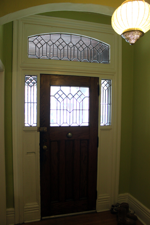
Having a bathroom this large on the ground floor of a Victorian house is rare and was definitely one of the features that sold us on the place.  This space would have originally been a hallway leading from the front door to the kitchen...I think this bathroom is a much better use of space.  Speaking of the front door, that brings us to the last space on the ground floor...the front vestibule.  This is the best before shot I have:
In this space, all we have done so far is paint and hang a new light fixture.
I wish I could say that we bought that light fixture while travelling in Morocco and that we met the artisan who made it and he was a really cool guy...but that would be lying.  We've never been to Morocco...we bought it at Home Sense...and it was on sale...only $50 I think!

So, there you have it - the rest of the ground floor.  We've been itching to tackle some projects upstairs in the fall and have been making lots of plans...stay tuned!

Oh, and here are the colours we used in these rooms:
Bedroom:  Benjamin Moore, Boothbay Gray, HC-165
Bathroom: Benjamin Moore, Gray, 2121-10 (really!  they couldn't come up with a better name?)
Vestibule: ICI, Shakespeare

Monday, July 11, 2011

The Kitchen ... So Far

As promised, here is a tour of our kitchen.  I don't want to call it a 'before and after', because there's definitely more work that we plan to do down the road in this room...so it's more of a 'before and so far'.
The biggest change we've made to the space is the addition of an island.  We both love to cook, so having the extra counter space is helpful...even more helpful is the dishwasher we added in the island.
The kitchen also sort of doubles as an office space, though more often than not, we end up just using the laptop in the Living Room.  That clock over the french door is our great-grandfather clock (it was a gift to Tessa's great-grandfather when he retired in the 1970's).  (Lots more photos after the jump!)

Monday, July 4, 2011

Back to Suburbia (Temporarily)

Unfortunately you read that correctly.  We have temporarily moved back to the suburbs.  Don't worry, we haven't sold our house or anything...but we did kind of rent it out.  You see, one thing I haven't mentioned is that the top floor of our house is a separate apartment that we have rented out since day one.  Our upstairs tenants let us know that after two years, they were purchasing their own house and would be moving out.  We decided that we wanted to get started on renovations upstairs and in the attic, so it would make sense for us to move upstairs and rent out the ground floor.  We began the process of renting out the ground floor and found amazing tenants right away!  Unfortunately, the plans of our upstairs tenants were delayed a bit...which put is in a conundrum.

We decided that since we have a place to move to temporarily (the in-law suite in my parents place where we lived for the first year of our marriage), we would let our upstairs tenants stay a while longer and we would move...twice.  So for two months, we are back in the suburbs....sigh.

The good news is, come fall, we will have a whole new floor of the house to tackle.  We're spending the summer planning some renovation projects, picking paint colours, and refinishing some great pieces of vintage furniture we've picked up.  Still...it was not easy to leave our beautiful ground floor, especially after all the work we put into it.  Now, it's a blank slate for our lovely new tenants:
Yup, we even re-painted the Living and Dining Rooms.  We'd been toying with the idea of an off-white for a while and when out new tenants asked for a lighter colour, we went for it.  We chose Benjamin Moore's OC-46, Halo.

I realized we haven't even had a chance to share the other rooms on the ground floor, so over the next while we'll be sharing the rest of the ground floor tour...even though someone else is living there now :(

In the meantime, we're trying to make the best of life in the 'burbs...going for lots of walks (even though there's nothing interesting to look at) and exploring the area by bike, which is something neither of us have really done before, even though we both grew up in the area.

Sigh...just 8 1/2 more weeks...

Friday, April 15, 2011

La Pièce de Résistance

Last week on Citify I mentioned that we had installed what I consider to be 'La Pièce de Résistance' in our Living Room. Did you spot it? Well, it's the new light fixture. It may sound strange, but finding a light fixture for this room has been a pretty big challenge. You see, there were many requirements that said fixture had to fill:
  • it had to be light since there is no electrical box to attach it to (originally there would have been a gas fixture here, it was converted to an electrical fixture later by poking some wires through the centre of the plaster medallion)
  • it had to have a small ceiling plate so as to not cover too much of the plaster medallion
  • it had to have both an uplight and downlight component (without any uplighting it would cast a shadow on the plaster medallion)
  • it had to be just the right scale, not too big / dominating and not too small / wimpy
  • it had to complement the light fixture in the nearby Dining Room as they can both be seen together
We spent many a hour scouring stores and the internet to find a light fixture that was just right.  Here are a few of the finalists:


1. Alhambra MES Spherical Suspension Light  2. Cactus Pendant Light  3. Modulo S35 Pendant Lamp

4. Ossy Pendant  5. Propeller Lamp  6. Saucer Criss Cross Lamp

In the end, we chose a Link Suspension Light in American White Wood by LZF - a company that works out of a converted winery on the outskirts of the village of Chiva in the province of Valencia, Spain.


The fixture is made up of Mobius strips piled on top of one another.  This arrangement makes for an incredibly sculptural piece that takes on different forms from every angle it is viewed from.  While the form is decidedly modern, we like the fact that it is made from wood, a natural material.  It gives the light so much warmth and helps it to 'fit in' amongst the many eclectic pieces of our living room.

Installing it was no piece of cake.  In fact, it took my dad and I 3.5 hours and several test installations before we were happy with the final product.  In the absence of a electrical box, we drilled into the no longer active gas pipe for support.  However, this left the ceiling cover plate hanging too low with a gap in between the cover plate and medallion.  Our choice was either to cut the gas pipe off higher, requiring us to also 'chisel' away at the delicate plaster medallion or to improvise.  We chose to improvise:


Thankfully, my Dad saves everything and he had another cover plate that was identical in finish and similar in size to the one that came with the fixture.  We used this to mediate the gap.  Essentially, the final product has a double ceiling plate.


Be honest now, if I hadn't told you that, would you have noticed?

We're quite pleased with the final result.  Lighting is such an important part of space design.  Horrible lighting can make a great space incredibly unpleasant while great lighting can really elevate an already great space into something, well...greater!

-kyle

Sunday, April 10, 2011

Living and Dining Room...After

As promised, here are some after photos of our Living and Dining Rooms:

So most of the new pieces in this photo are from...you guessed it...Ikea.  Expedit shelves, Mongstad mirror, Gilbert Dining Room chairs (though the colour has since been discontinued), and the Olunda alphabet print (the perfect print for an Interior Designer turned Preschool Teacher...aka, Tessa). (see it before)

Our Dining Room chandelier, purchased from Living Lighting. (see it before)

Though everything around it has changed, the fireplace remains the same...more on that later.  The rug in this photo was from...cringe...this place, but it was a steal at $30!  The painting, lamp, and vase were all from Home Sense (we're clearly still being weaned off of big box stores...sigh) (see it before)

We rescued this couch from the peril of dumpsterdom at Ikea (as it was being discontinued), though we still had to pay for it, it was a great deal!  The painting is a Tessa original...based on one that Ikea used to sell. (see it before)

There's the newest addition to our family.
(see it before)

The bay window with a chaise, also saved from Ikea dumpsterdom.
(see it before)

There you have it.  The Living and Dining Rooms as they look today.  The colours are Benjamin Moore with Boothbay Gray (HC165) on the walls and Wrought Iron (2124-10) above the fireplace. 

As I said before, for now, the rooms are done.  There are a couple longer term things we plan to do, such as refinish the hardwood floors, do something with the fireplace...and Tessa is already thinking of repainting!

-kyle and tessa


Tuesday, April 5, 2011

Reuse, Refinish, Re-Purpose

We knew when it came to furnishing our house that buying all new furniture just wouldn't cut it.  Not only could we not afford it but placing all those new objects in a space that has evolved over 120 years would rob it of its character and soul.  And so...we have mixed up a few new items with ones that have been Reused, Refinished, and Re-purposed.

See, there are way more than just 3 R's.  In fact, the greenest, most environmentally friendly product is the one that's never made.  Here are a few of my favourite 'vintage' items from our Living and Dining rooms.


Our sideboard has quite a story to tell.  We found him while on a weekend getaway in Ottawa, Ontario.  It was in an antique shop specializing in Scandinavian mid-century modern antiques (I think this one).  After scouring the shop and finding everything was way out of our price range, we headed down to the basement where we uncovered this piece, collecting dust in a corner...for only $300!!  You see, it's made of white oak, not teak like most Scandinavian pieces.  It's also meant to sit on top of a larger sideboard as a hutch (the owner added the legs).  These two factors combined to make the price just right for us.

But how to get it from Ottawa to our house, 500+km away?  Thankfully, the owner of the shop makes frequent trips to Toronto (only 60km away...in case you haven't figured it out, we live in Hamilton!) and agreed to bring it that far during his next trip.  So we met him there...in our compact car a drove it all the way home with it sticking half way out of our trunk!  But we made it and boy do we love this piece!


It's not all about big pieces.  We found this suitcase when Tessa's grandmother was downsizing and getting rid of things.  Man, this suitcase has been around.  It's dented and scratched, but still solid (thanks to its 'four-ply solidon construction'...according to the McBrine Baggage label on it).  Just think of where this suitcase has been and what has it seen!  Now it sits in a corner of our dining room and houses old photo albums.


This Dining room table belonged to Tessa's parents.  We found it in a corner of their basement and claimed it as ours.  Apparently when Tessa's parents were first married, her mom lovingly sanded and refinished it.  When we got our hands on it we painted it a pale blue!  Wood table on wood floor = blah.  Painted table on wood floor = win!  I like the proportions of its slender bulbous legs and how cool is it that it was made by good old Walter and Company in Wabash, Indiana?  Still, it's a bit small for the space.  Stay tuned for our DIY projects post to see how we solved that...


We went through a painting stuff phase (perhaps stemming from the fact that Tessa worked in a paint/interiors store a few years back).  These chairs were another find at Tessa's grandmother's.  This time we went with a high sheen black/blue/grey (depends on the light).  Sturdy chairs.  In fact, I'm sitting on one, RIGHT NOW!

 '
Finally, something we 'aquired' from my side of the family.  This 1960s chair belonged to my grandmother.  And guess what?  It's a pull out.  So if you're ever in town, we've got one super uncomfortable 50 year old pull out twin sized bed (my 8 year old self can attest to this lack of comfort).  In chair form...it's great though.  I'm told my grandmother re-upholstered it at some point, probably in the 1970's.  And who's that perched on it you ask?  Charles Augustus, our schweenie of course - he has excellent taste.

There you have it - our reused, refinished, and re-purposed pieces - each with it's own story to tell.  I'll post some overall pics of these rooms soon so you can see how these vintage pieces are balanced out by newer pieces.

-kyle